Painting the town purple

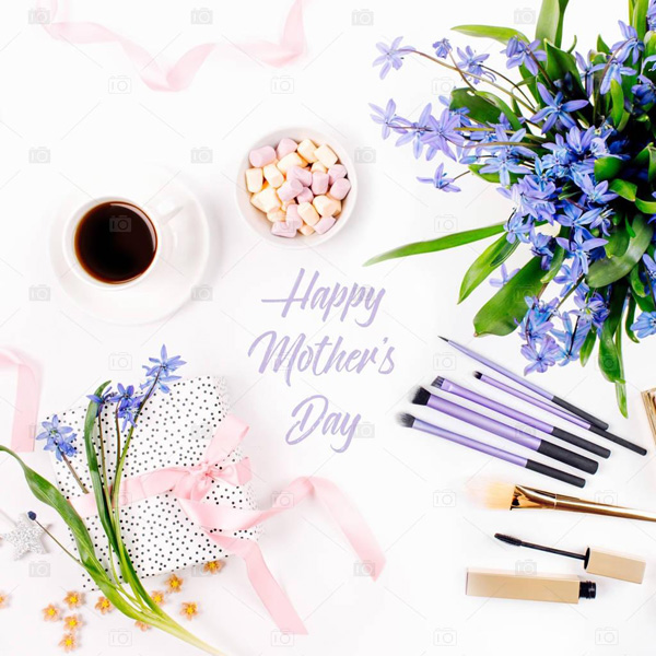
Each year, Pantone chooses a hue that it says will inform the colors in our lives. In 1999, when the consulting firm began naming a color of the year, the focus was on clothing, beauty and home decor.
In recent years, however, Pantone has chosen a color (sometimes colors) that goes beyond the influence of fashion and taps into the watercooler chat of the moment. As a result, the much-anticipated color of the year is now a statement of our lifestyle as well as what's going on in the world.
For instance, the 2016 colors of the year were rose quartz and serenity, hopeful shades Pantone said spoke to gender fluidity. The 2017 color was greenery, both a shout-out to nature and an attempt to steer a divided America toward peace.
It can be said that ultra violet is a nudge to force us to stand in the now-Eiseman says it's an uncanny coincidence that the national nonprofit organization Women Against Abuse uses a shade very close to ultra violet in its awareness campaigns. Pantone's color of the year is considered a measure of the world's mood, but Eiseman stresses that it's not meant as a political statement.
Instead, Eiseman points to the positive: 2018 is shaping into a year where we might find ourselves taking chances on the unknown. Creativity may be calling.


